Logo Redesign - Roydon's Motor Inn
Roydon's - a Tamworth Motor Inn requested a redesign of their previous logo as the venue moves forward under new owners.
The brief was to use the colour palette envisioned for the refurbishment of the Motel.
The brief was to use the colour palette envisioned for the refurbishment of the Motel.
They wanted both a Monogram for Socials and a full logo transformation to be able to use on signage across the venue.
The design uses a custom typography and hand drawn illustration that draws on the native flora surrounding the Motel and the country heritage of the building.
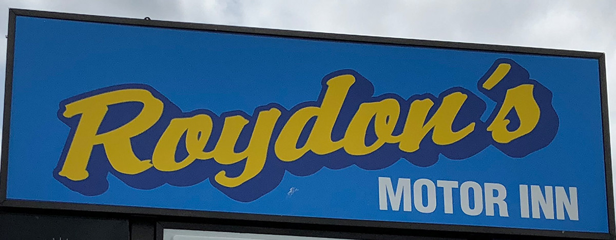
BEFORE
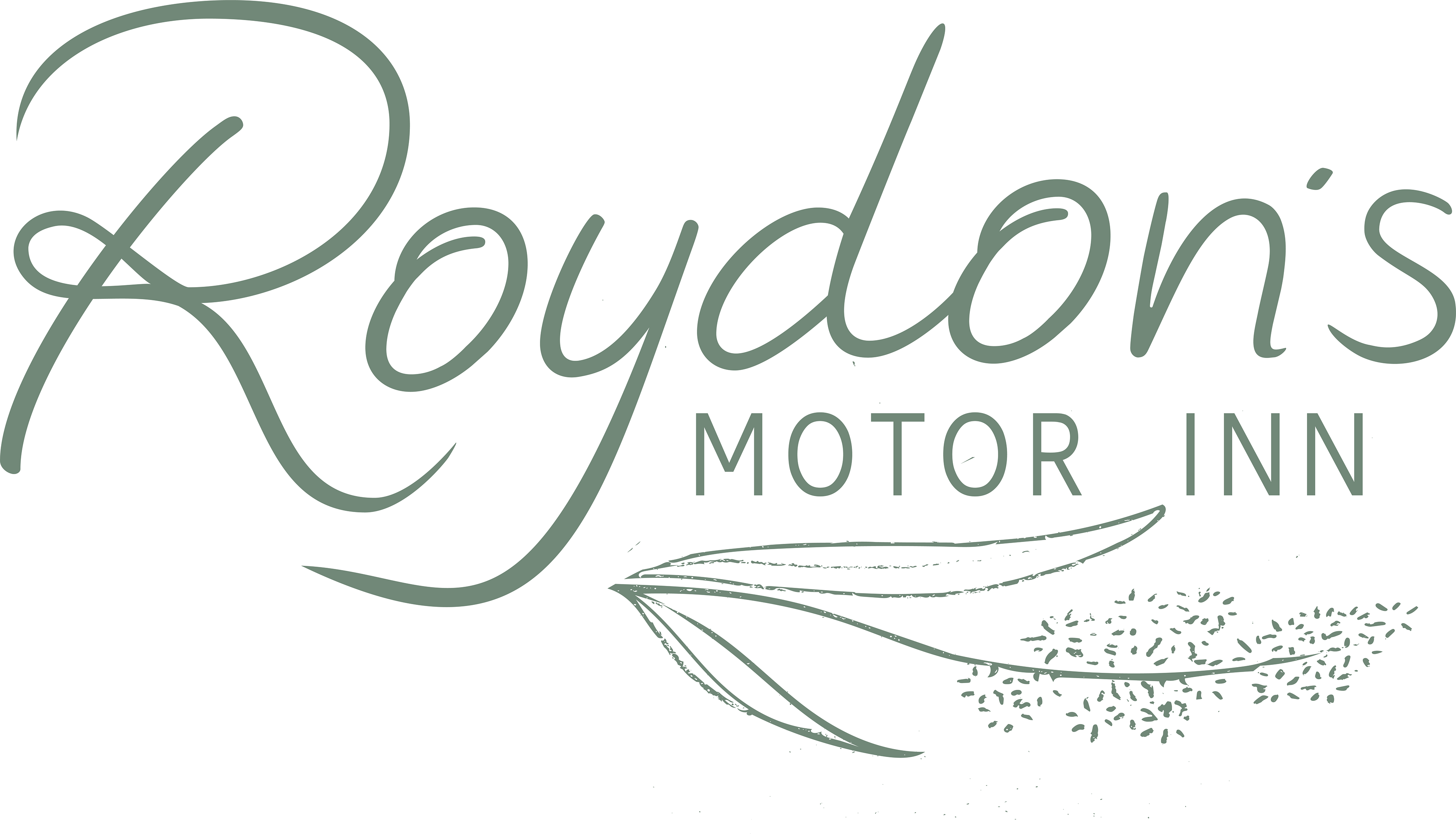
AFTER
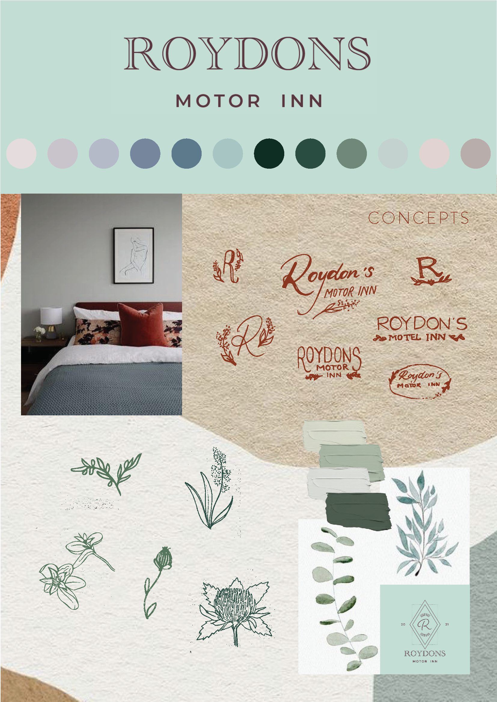
Research
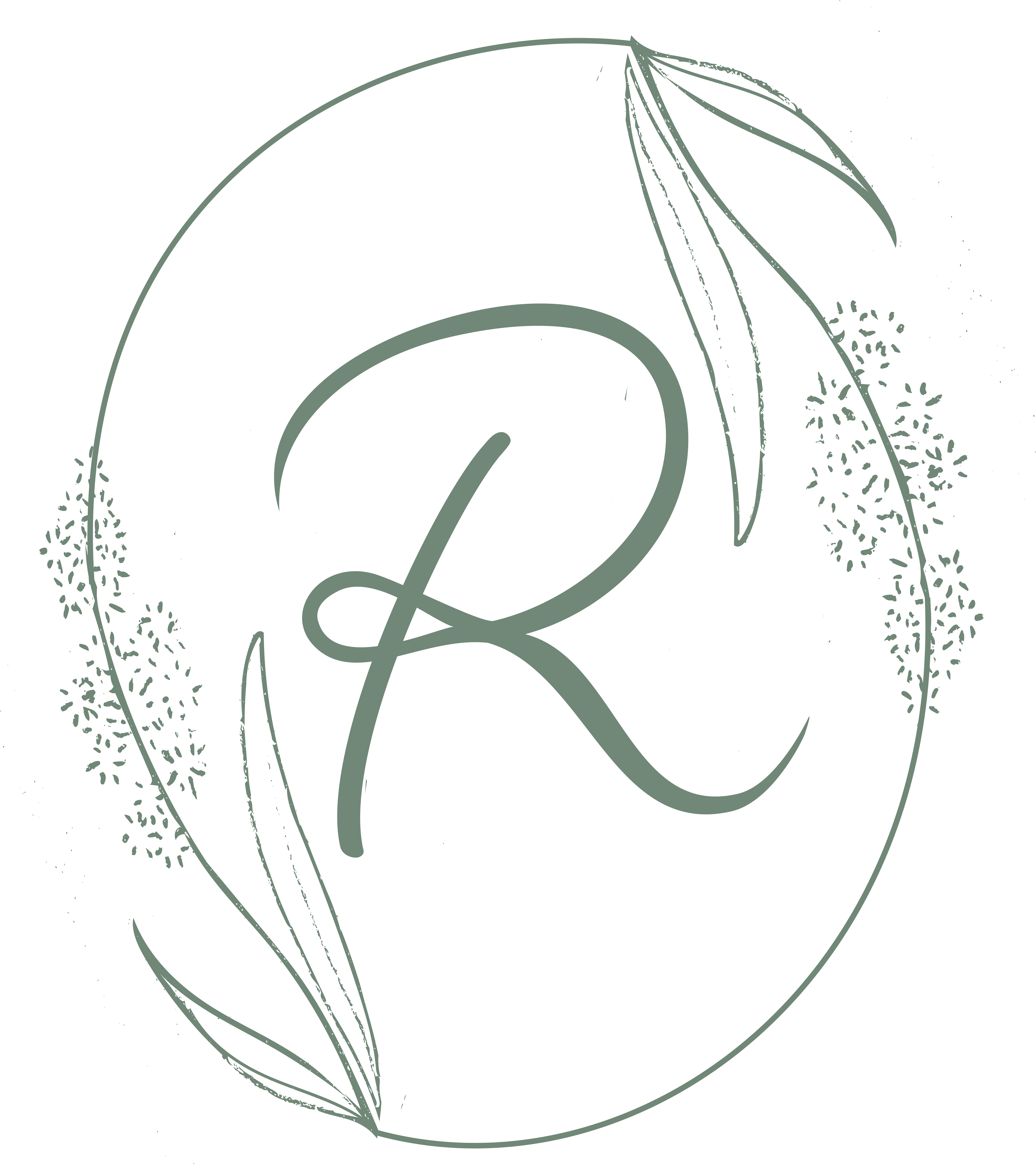
Light Monogram

Dark Monogram
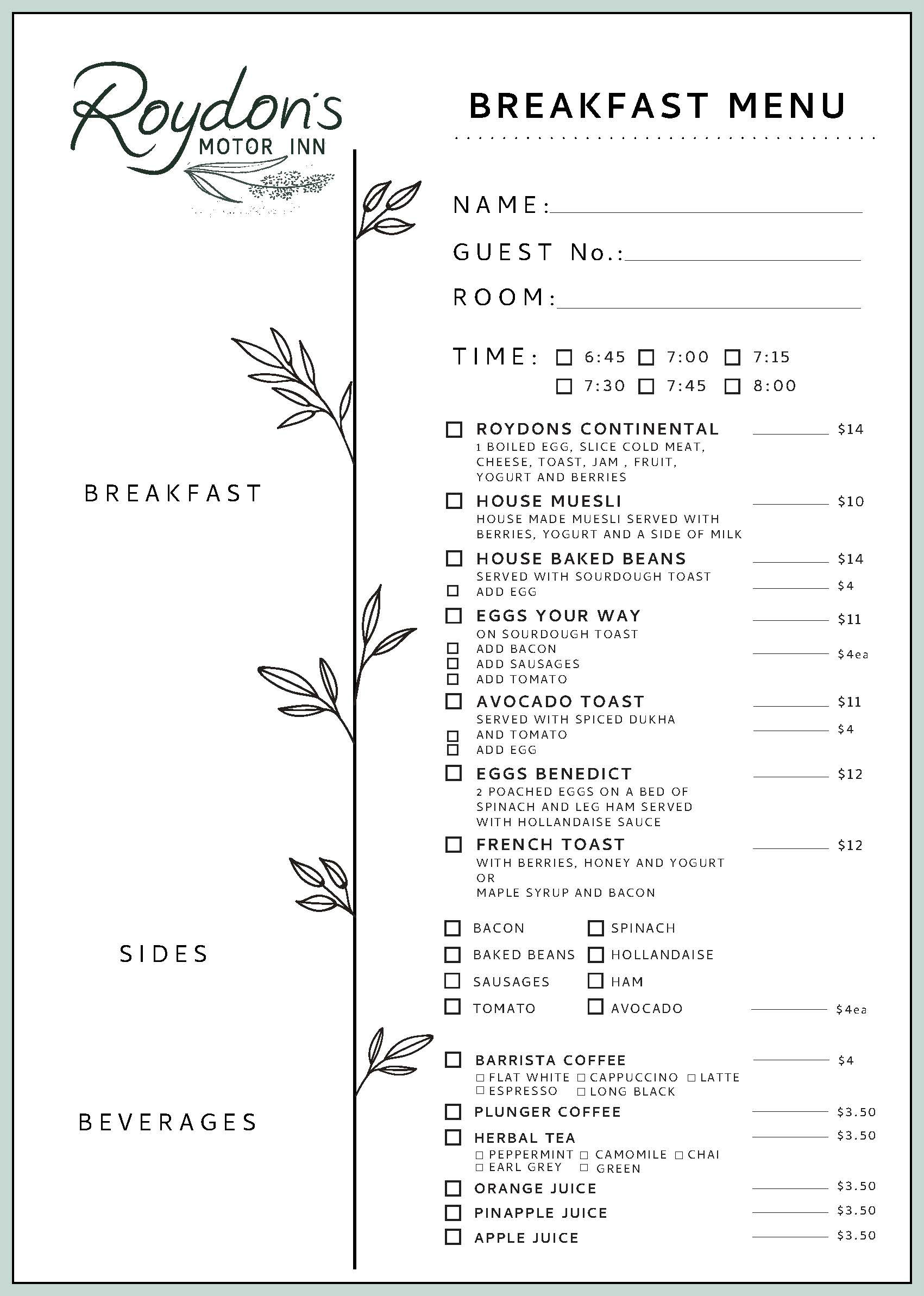
Menu
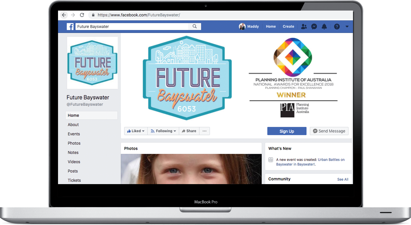
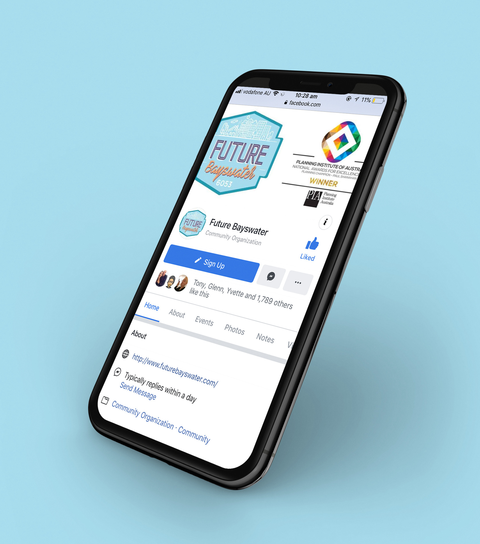
Logo Refresh - Future Bayswater Community Organisation
I was commissioned the task of creating a refreshed logo design for the Perth community organization Future Bayswater. They wanted a more modern design that still used the colours of the previous design but had a more mature and trendy vibe that could be used both digitally and in merchandising material.
Concept:
I wanted to design a logo that would both encompass the organizations vision for the future and would fit the target market of families and young people they wanted to attract.
The logo is a stamp design that can fit onto many different social platforms and merchandising material. Keeping with the colours of the original I simplified the design with bold typography and iconography representative of the organization's values.
The logo is a stamp design that can fit onto many different social platforms and merchandising material. Keeping with the colours of the original I simplified the design with bold typography and iconography representative of the organization's values.
Time Frame: 2 day turnaround
Roll out: Logo, T Shirts, Stubby Holders.
Roll out: Logo, T Shirts, Stubby Holders.
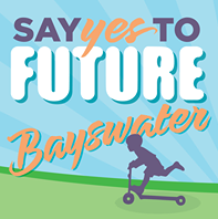
BEFORE
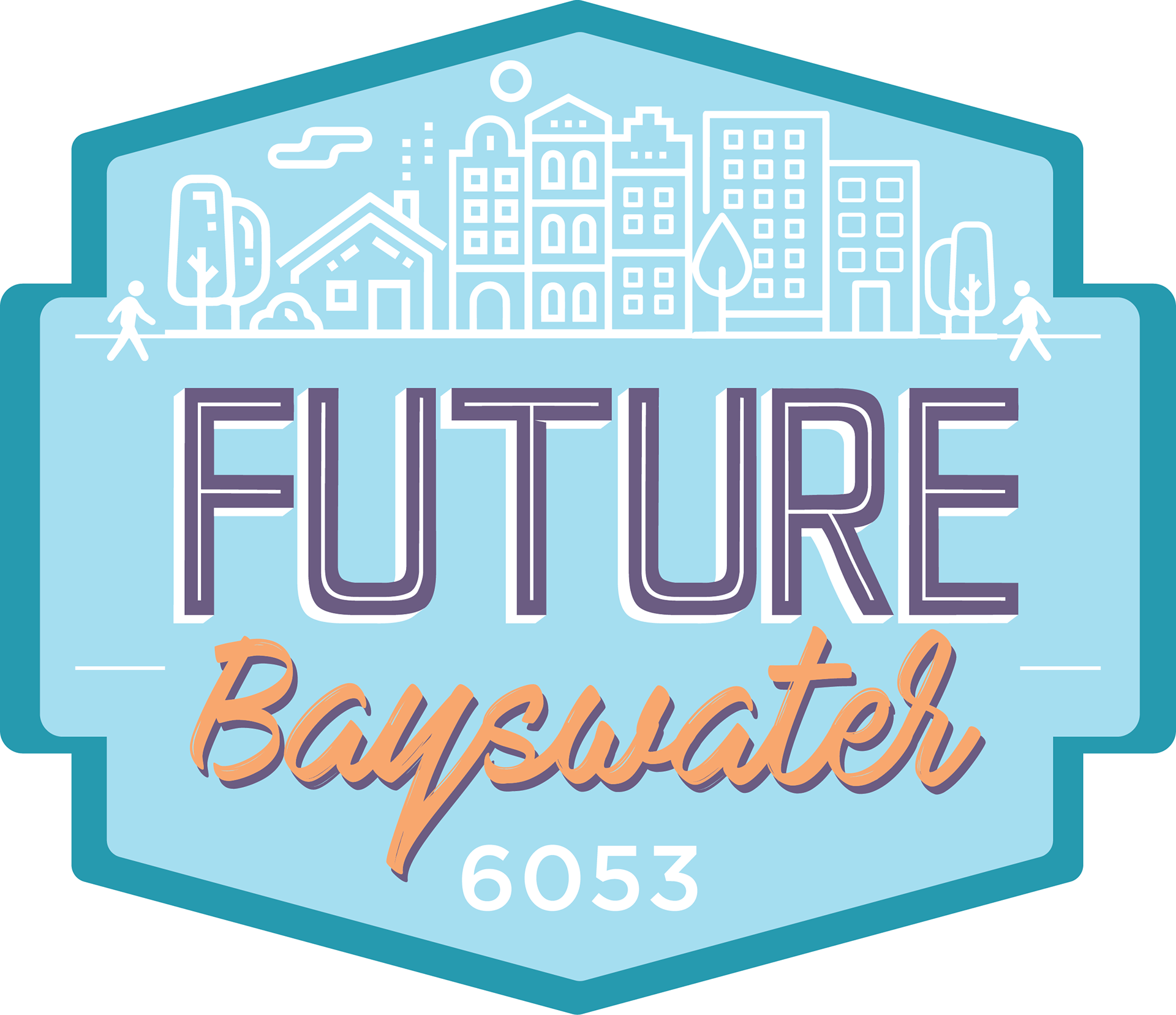
AFTER